
*Left to Right*
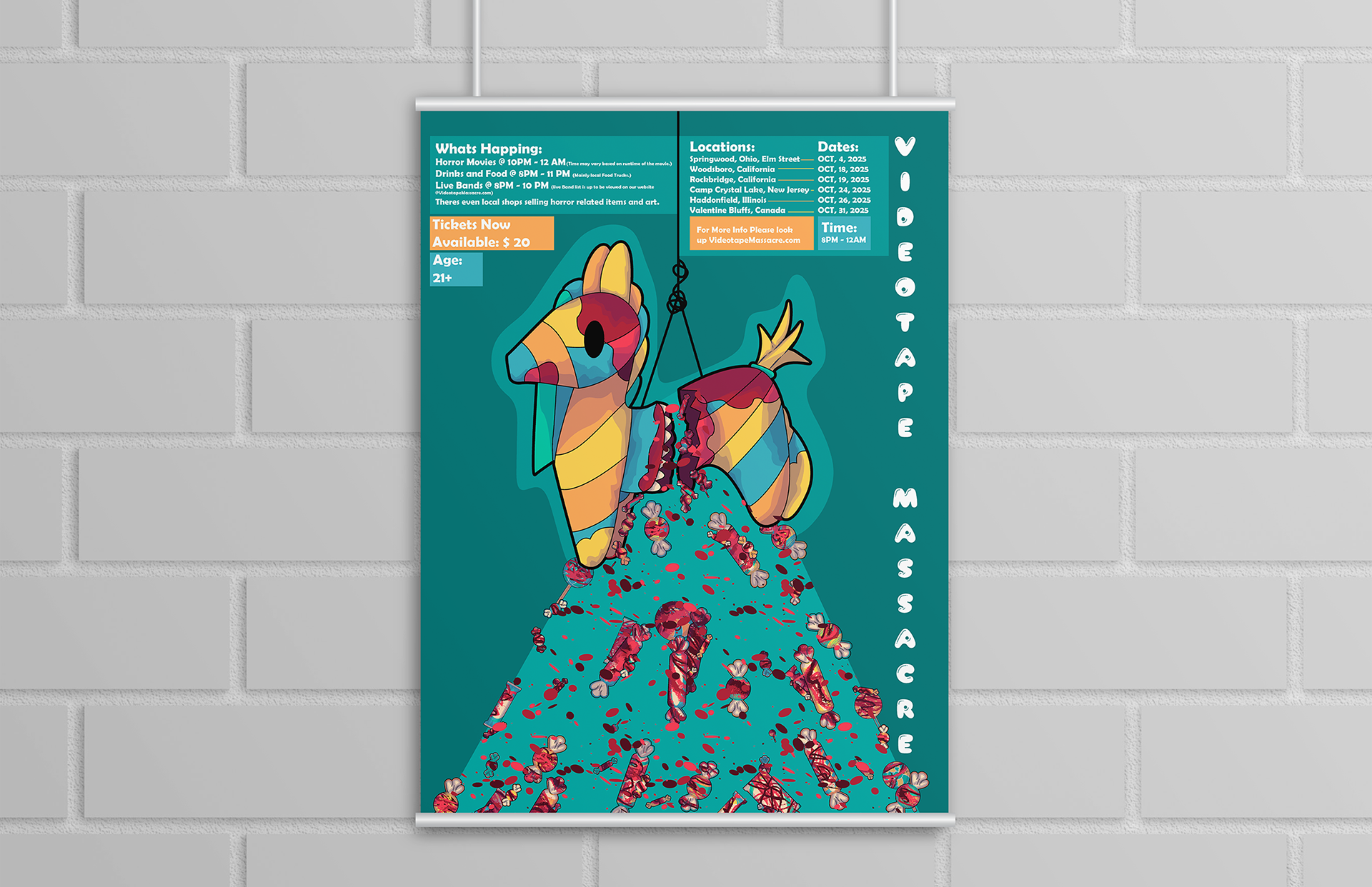
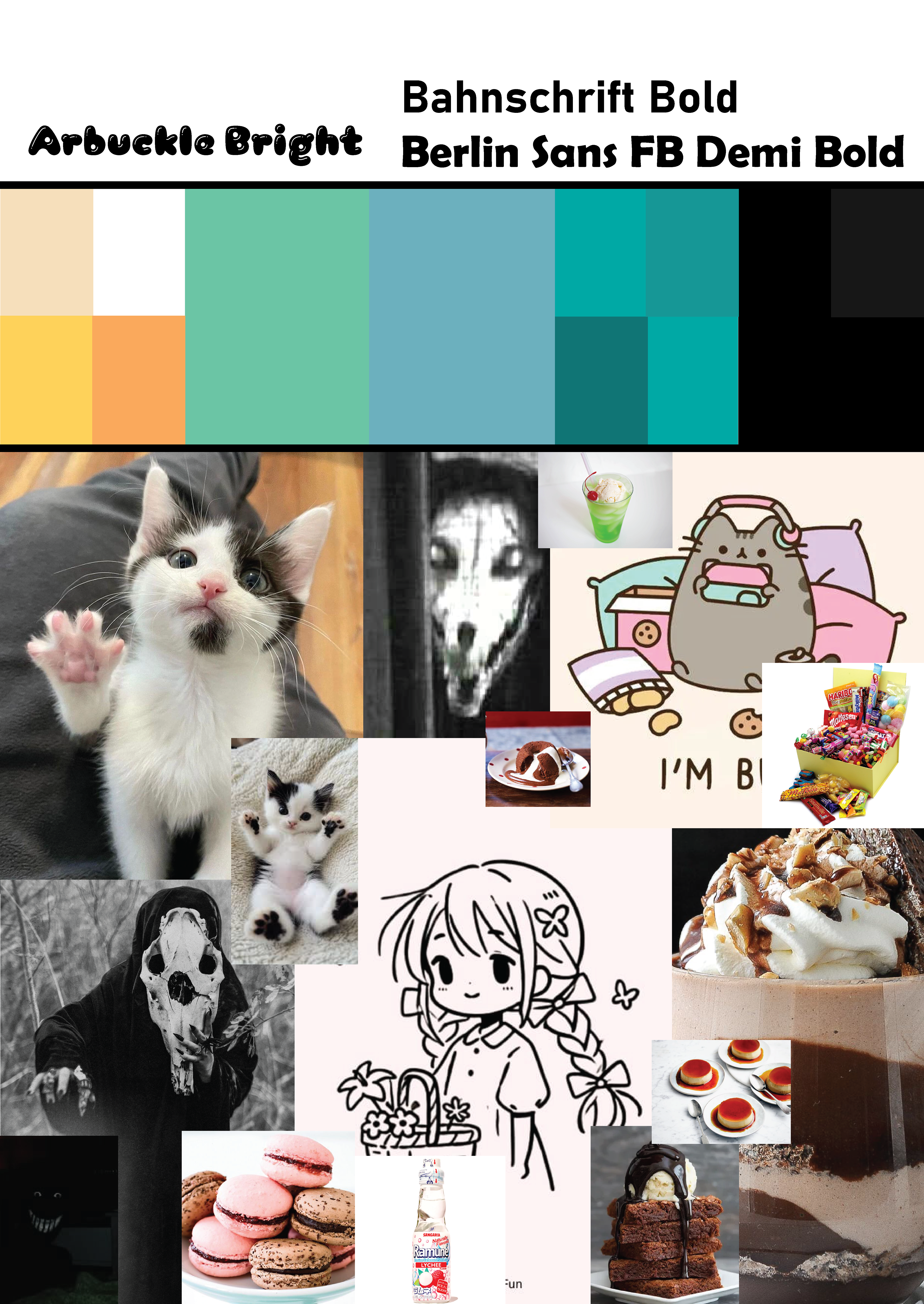
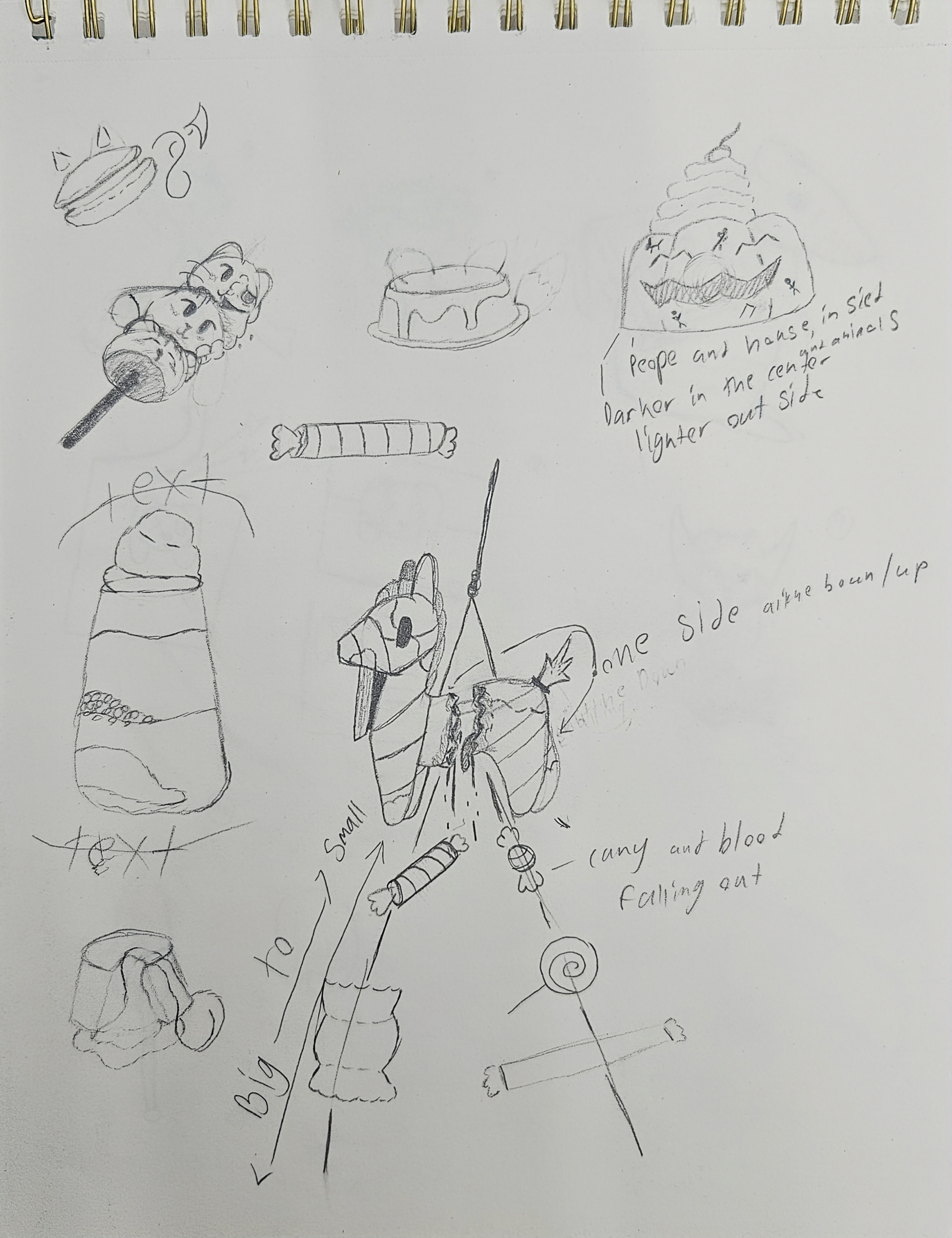
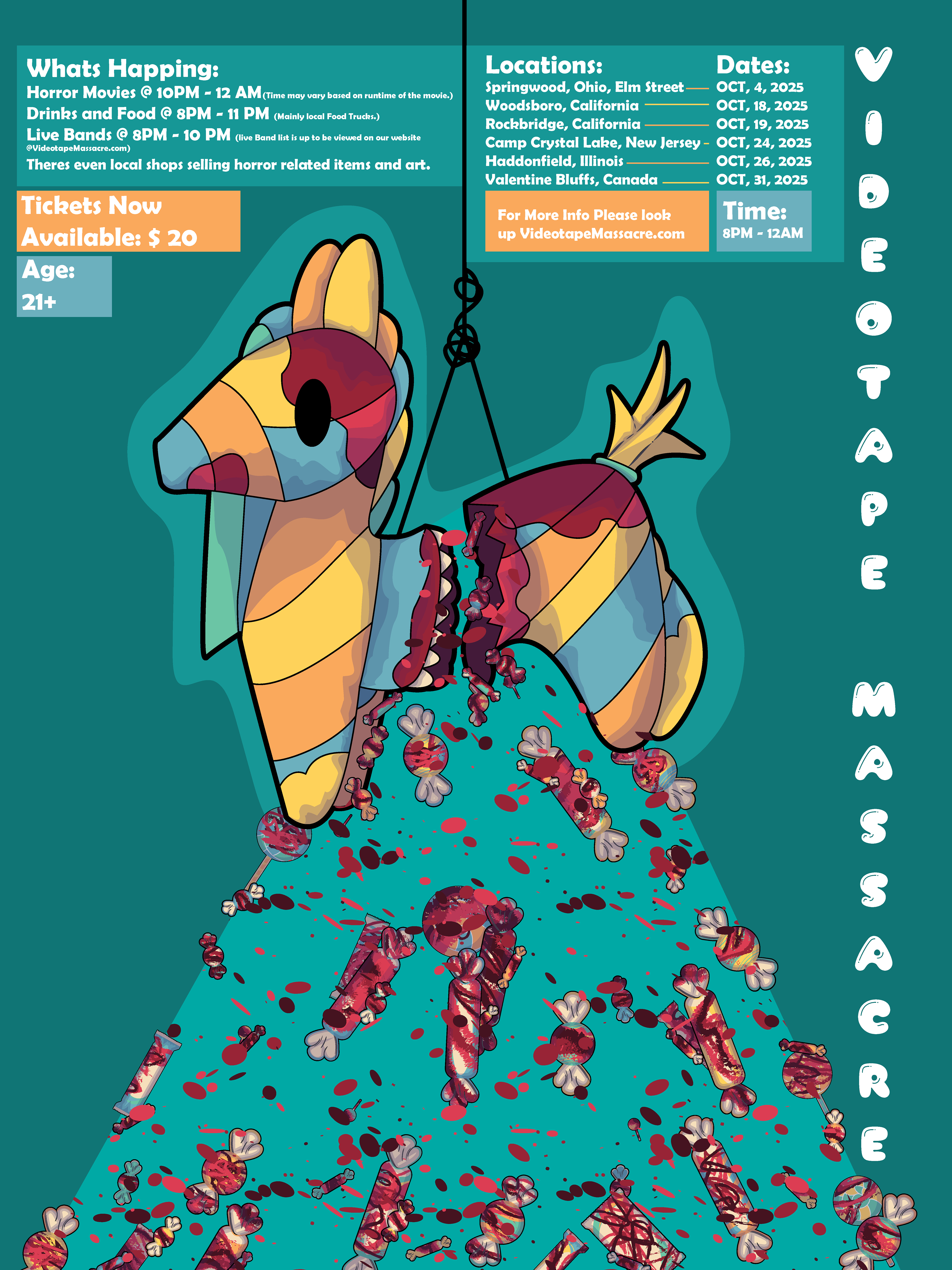
Progress: To start, I made a mood board with the starting color scheme to be used along with showing the theme of cute, creepy, with gore, and having it be some type of food item, mainly a sweet. Along with type choice, one is to be the cute type for the title, and the other is to be my main/readable text. Then I did a few sketches of what I wanted for the poster. Before landing on the piñata design with guts, blood, and candy falling out. After that was done, I made the imagery in Illustrator. With way more than several different candies designed and the piñata. As I designed it, I added three reds to the work. Then I made the background the template or a way to emphasize the piñata and the candy, and the blood falling out. Next was the type; the type was made to go horizontally to fit the poster better. Almost like balloons floating. The other type was used to build or move around the image while also sharing important information. The towns are based on slasher movies themselves, just to add a little treat to anyone.